The Ultimate Color Styling Guide: How to Use Color in Interior Design
|
|
Time to read 4 min
|
|
Time to read 4 min
The entryway is your home’s first impression, setting the mood for what’s beyond. Whether you have a spacious foyer or a cozy hallway, thoughtful design choices can create a warm, welcoming, and practical space. Here are 8 entryway decor ideas that blend aesthetics with function.
Table of contents
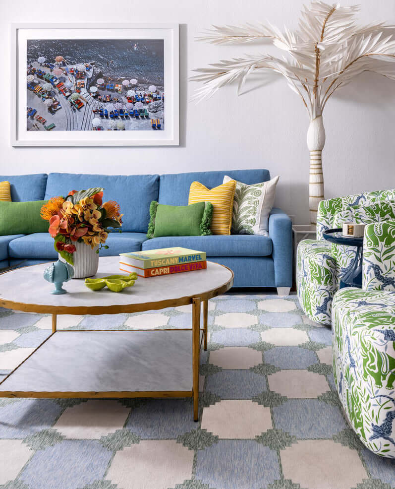
Color has the power to transform a space, evoking emotions and setting the ambiance of a room. Whether you prefer a calming neutral palette or vibrant statement shades, understanding color styling is key to designing a home that feels balanced, inviting, and uniquely yours.
Here’s how to master color styling with expert-approved tips and trends.
Colors influence mood and perception, making them a crucial aspect of interior design. Here’s how different colors impact a space:
Warm Colors (Red, Orange, Yellow): Energizing and welcoming—perfect for social spaces like living rooms and dining areas.
Cool Colors (Blue, Green, Purple): Calming and soothing—ideal for bedrooms, bathrooms, and study spaces.
Neutrals (White, Beige, Gray, Greige): Timeless and versatile—great for creating a balanced foundation.
Bold Colors (Black, Jewel Tones, Deep Shades): Dramatic and sophisticated—best used as accents to add depth.
A well-balanced color palette ensures that your home flows seamlessly from one space to another. Our Homekin experts suggest these styling methods to create harmony:
The 60-30-10 Rule:
60% Dominant Color (walls, large furniture)
30% Secondary Color (textiles, accent furniture)
10% Accent Color (decor, art, accessories)


Monochromatic Palette: Uses variations of a single hue for a sophisticated and calming effect.
Complementary Palette: Combines opposite colors on the color wheel for contrast (e.g., blue & orange).
Analogous Palette: Uses adjacent colors for a harmonious, nature-inspired look (e.g., green, teal, blue).


Each room in your home serves a different function, and color styling should enhance its purpose. Here are some Homekin expert recommendations:
Bedroom: Muted blues, sage green, or lavender for a calming retreat.
Living Room: Warm neutrals (beige, taupe) or soft greens for a welcoming atmosphere.
Dining Room: Rich jewel tones (emerald, burgundy) to enhance ambiance.
Kitchen: Crisp whites, soft grays, or deep navy for a fresh, timeless look.
Bathroom: Light blues, soft pastels, or charcoal for a spa-like feel.
Home Office: Earthy greens or warm neutrals to boost productivity.
Home Office: Earthy greens or warm neutrals to boost productivity.
While classic colors never go out of style, experimenting with trends can refresh your space. Current 2025 trends include:
Expert Tip: Pair matte-painted walls with high-gloss furniture or metallic accents for balance.
Use trend colors in accessories, art, or textiles for an easy update without commitment.
Even with a strong color palette, texture adds richness and dimension to your home. Try:
Expert Tip: Pair matte-painted walls with high-gloss furniture or metallic accents for balance.
Choosing the right colors can be overwhelming, but Homekin’s design experts are here to color guide you. Book a consultation today for a custom color styling plan tailored to your home.
Start small with pillows, rugs, and wall art before committing to larger elements like paint or furniture.
Use light tones, mirrors, and monochromatic palettes to enhance openness.
Greige (gray + beige) offers warmth and versatility, making it a go-to neutral for contemporary spaces.
By mastering color styling, you can create a home that’s not only beautiful but also reflects your personality and lifestyle. Thoughtful color choices can enhance mood, improve functionality, and bring balance to every room. Whether you're refreshing a single space or redesigning your entire home, expert guidance can make all the difference. Need help? Book a consultation with Homekin’s designers today.
Natasha Penzo
With a passion for transforming spaces into beautiful, functional havens, and years of expertise in interior design, architectural planning, and project management, Natasha specializes in creating personalized interiors that reflect her clients' unique styles and needs. Under her leadership, Homekin has become a trusted name in the industry, offering innovative solutions and expert guidance for every aspect of home.
Toronto - New York - Atlanta - Boston - Chicago - Denver - Miami - Naples - Salt Lake City - Austin -
Charlotte - Dallas - Houston - Los Angeles - Philadelphia - Seattle - Washington DC


